An (arguably) better UI
Why did Chattable redesign into something modern and minimalistic? Since it's debut in 2021, Chattable has made its name by being that indie alternative to website chat widgets like cbox with a design so hand crafted that it was almost bad.
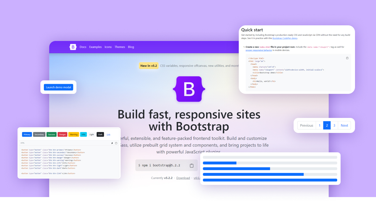
So why did it change? The answer is, Bootstrap. Bootstrap is a modern front end library that happens to be (over) used in the tech products industry. Understandably so because it provides a really elegant look with a layout that everyone is already familiar with. Having a familiar UI is key to retaining new users, if the UI is too complex or very easy to get lost in, many users will "give up" after their first few interactions.
I also think some personal reasons tied into this decision. I wanted to work with a front end library to add it to my web dev portfolio, so I can show others I am capable of learning different libraries or frameworks. Bootstrap was the first one I researched since I remember when it first became mainstream and I loved how it looked.
At the end of the day, the changes to Chattable's design was for you. I wanted to make things easier for existing users, and more obvious for new users. Thanks for reading!